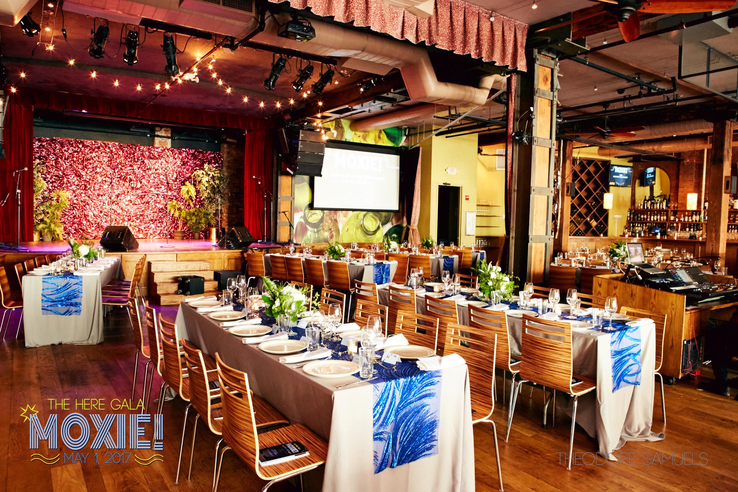
For the gala, we wanted to design something that highlighted the spirit of HERE – an organization that presents brave artists and that has a lot of personality. Once we came up with the name (MOXIE!), which we felt was a word that really encapsulated what HERE stands for, the design came into place. For MOXIE!, the design was a riff of 30's-era Art Deco, more South Beach than Great Gatsby- with neon and bold, fun imagery.